Defying Digital
September 27th, 2007I was cruising through Daring Fireball’s Linked List today, when I stumbled on the Ironic Sans blog. I was captivated not by the content, which is what motivated John Gruber to link it, but by the stunning visual appearance of the page design.
I have a soft spot for digital media that defies its nature and tries to adopt a more organic appearance. I suspect a lot of people share this aesthetic preference, so it’s ironic (heh, heh) that we don’t see more of it. I suspect the reason we don’t is because it’s really hard to do right.
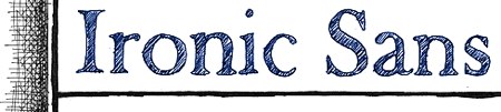
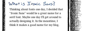
What’s particularly good about the Ironic Sans blog is that it captures a lot of the clean perfection of digital while still being jaggy and texturized. The banner headline is perfectly legible in spite of its beautifully bleeding hatched fill. Meanwhile, the cross-hatched pattern that frames the page gives a clear border for the more-or-less conventionally faced digital content.
The juxtaposition of pseudo-analog and digital content just, I don’t know, it makes me excited. It makes me want to look at the site for its own sake. In fact, I wrote most of this blog entry before bothering to actually read the content that Gruber had linked to, a geeky encoding of the New York skyline into gray-scale representation of a histogram.
Some of you are probably wondering, if I like this digital defiance so much, why doesn’t Red Sweater’s design embrace it? Well like I said, I think it’s actually really hard to do right. But if I were a designer, I think I’d really enjoy working on this kind of digital design.
Update: Check out the blog post describing Ironic Sans’s design, pointed to in the comments by the site’s designer/author.


September 27th, 2007 at 4:32 pm
Hey, that’s a really flattering write-up. Thanks! You may be interested in an entry I wrote about a year ago, detailing the work that went into designing Ironic Sans. You can see it here.
September 27th, 2007 at 11:05 pm
That really is a different-looking website. I like it very much.
But can it get any more geeky than that trick with the histogram??
September 28th, 2007 at 9:03 am
How about Ambrosia’s game that’s like that? Sketch Fighter 4000 Alpha.
September 28th, 2007 at 5:06 pm
A very cool design. I’ve started reading Understanding Comics, and the notion that cartoons and icons can be more powerful and universally recognizable then realistic images has really gotten me thinking about the utility of two-color “cartoony” interfaces, like Ironic Sans.
Personally I’m also a big fan of digital mechanical watches — a traditional mechanically wind-up pocket watch, with a digital display (think like an odometer) actuated entirely by springs and sprockets. Defying Analog is neat too :-).
September 28th, 2007 at 8:16 pm
Wouldn’t a font named Ironic Sans need to be sans-serif? Just something for him to think about before he starts designing his font. Very nice design, nonetheless.